
Puget Sound Partnership Interview
Typography
Typography is based on the messaging and genre of a project. Accelerate is a entrepreneur business magazine so fonts are thin and clean but the story is about a creative person which opens up the idea to be flash with a thick cursive font. Military Poster is more traditional serif fonts while also trying to make it look vintage and older.


UX/UI Design
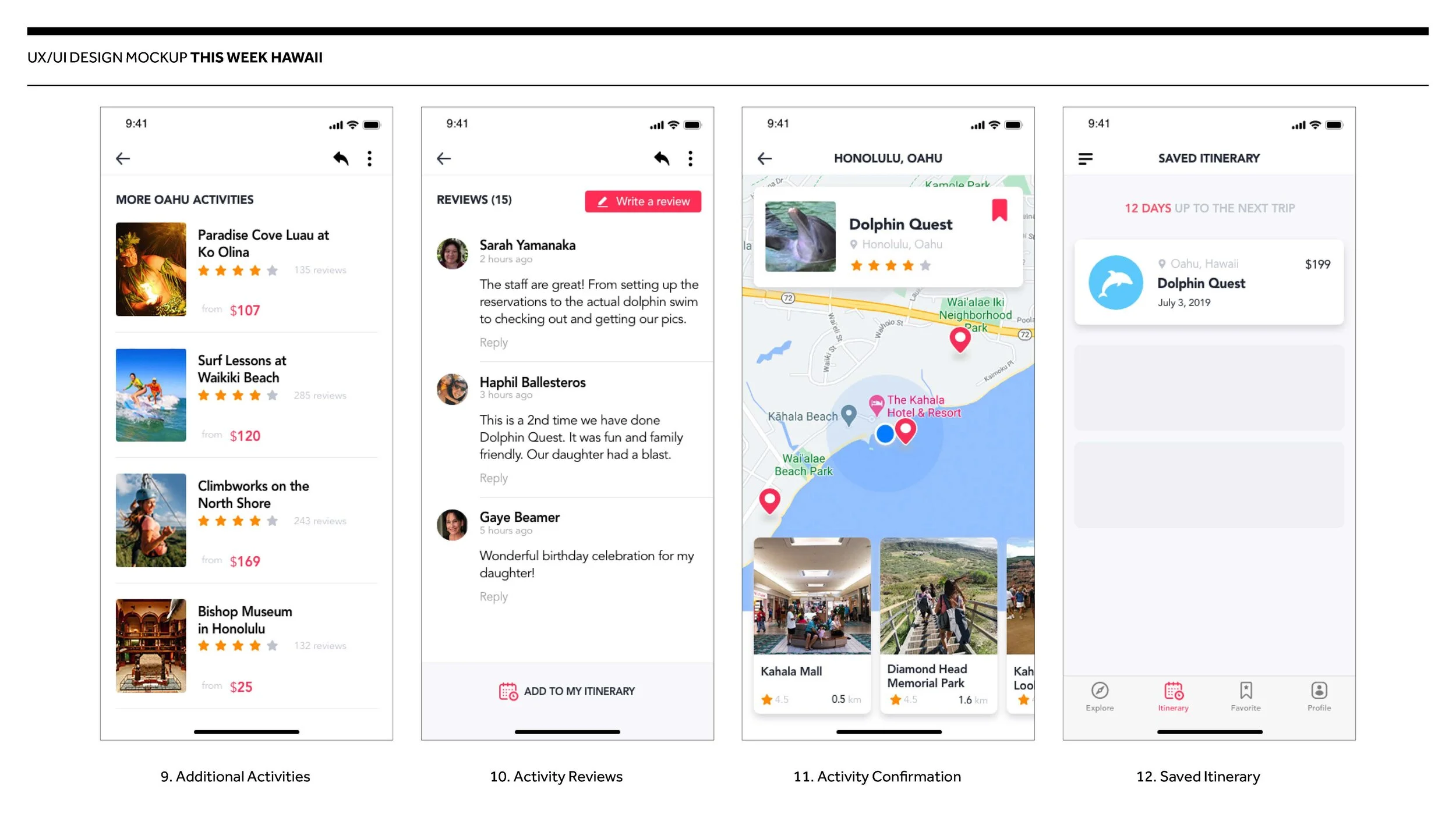
We wanted to create an app that would act as a itinerary of activities that you can book before you get to Hawaii. The process would drive people to log in, create an itinerary for their future trip, book, and partake in the experience. Users would be able to choose which island they are visiting and search through a list of activities that are also separated by region. Users will also be able to look reviews, photos from a community of users, and a list of nearby attractions such as shopping centers, hiking trails or restaurants. What makes this app unique is that we would get special offers only available to us with our advertisers.


Color Usage
Using colors to identify the different services in the same ad. It's important to make sure that they compliment each other and are not strong enough to overpower the flow of the ad.


Chart or Infographic


Brand
Logo Development, Creating style sheets to give my clients perception on what it looks like on different mediums, and finally building out collateral with that brand.
